Coffee Gnome: A Vintage Display Font for Modern Web Design
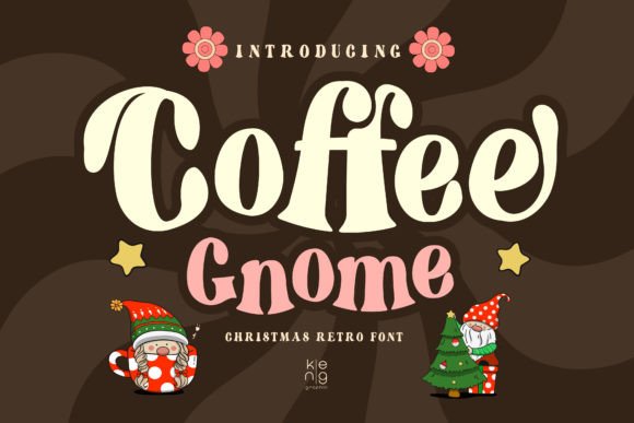
Two weeks ago, I was finalizing the hero section of a boutique online store’s new product landing page—think hand-poured cold brew, ceramic mugs, and minimalist packaging—and realized the headline font wasn’t landing right. It felt too sterile, too neutral. So I pulled up Coffee Gnome, a clean and smooth vintage-style retro display font, and dropped it into the H1. Instantly, the tone shifted: warm, intentional, quietly confident. Not kitschy. Not dated. Just authentically human—exactly what the brand needed.
Coffee Gnome for Hero Sections and Landing Page Headlines
Coffee Gnome shines brightest where first impressions matter most: hero sections, campaign banners, and above-the-fold headlines. As a display font, it’s built to command attention—not blend in. Its smooth curves and balanced letterforms give it exceptional legibility at larger sizes (48px+), even over textured image backgrounds or subtle gradients. I tested it on both light and dark mode variants of the same layout, and it held up cleanly without needing heavy stroke adjustments or extra letter-spacing. For web designers building landing pages, this means less fiddling and more consistency across devices.
Coffee Gnome for Boutique Online Stores and Product Branding
When styling product cards and category banners for that same coffee-focused shop, I used Coffee Gnome sparingly—but deliberately. Only for product names (“Sumatra Reserve,” “Honey Process Blend”) and limited-edition tags. Why? Because Coffee Gnome is a display font, not a text font. It’s designed for impact, not endurance. Pairing it with a friendly, highly readable sans serif like Inter or Manrope for body copy created clear visual hierarchy: personality upfront, clarity everywhere else. That balance helped guide the eye naturally from headline to description to CTA—no cognitive friction.
Coffee Gnome for Portfolio Websites and Creative Brand Kits
I recently added Coffee Gnome to a digital brand kit for a ceramicist launching her portfolio site. Her work is tactile, earthy, and quietly refined—so the typography had to echo that. Coffee Gnome delivered that vintage charm without leaning into cliché. Its PUA encoding made inserting custom glyphs (like small floral ornaments or monogram alternates) seamless in Figma and Webflow. And because it’s a well-structured font, exporting SVGs for social media graphics or embedding as a variable webfont felt reliable—not like gambling with rendering glitches.
Coffee Gnome for Blog Headers and Editorial Web Design
For a lifestyle blog redesign, I used Coffee Gnome exclusively for post titles and section dividers—not body text, not captions. Its gentle contrast and open apertures kept readability high even at 36px on mobile. On smaller screens, I adjusted line-height slightly (+0.1) and ensured fallbacks were defined in CSS so the hierarchy never collapsed. As a display font, Coffee Gnome doesn’t need bold weights to stand out; its inherent character does the work. That meant cleaner font stacks, faster loading, and no unnecessary weight bloat.
Coffee Gnome for Course Sales Pages and Coaching Websites
On a course sales page for a mindful productivity workshop, Coffee Gnome anchored key emotional hooks: “Start Your Calm Morning Ritual,” “Designed for Deep Focus.” Short phrases. High resonance. The retro warmth softened the transactional feel of the page—making the offer feel personal, not promotional. Crucially, Coffee Gnome includes full Latin character support and smart spacing, so accents, em dashes, and curly quotes rendered cleanly in all browsers. No surprises. No last-minute font swaps before launch.
How Coffee Gnome Performs in Responsive Layouts
In responsive testing, Coffee Gnome held up best when used at ≥28px on mobile and ≥42px on desktop. Below that size, letterforms began to lose their distinctive rhythm—especially on low-DPI Android screens. My rule now: reserve Coffee Gnome for headings, buttons with ≤3 words, and decorative accents only. Never for navigation labels, form fields, or paragraph text. As a display font, its strength is intention—not ubiquity.
Font Pairing Tips for Coffee Gnome in Web Projects
I consistently pair Coffee Gnome with neutral, highly legible sans serifs: Inter for UI-heavy sites, Lato for warmer brand voices, or even a crisp mono like IBM Plex Mono for tech-adjacent projects. Avoid pairing it with other display fonts or overly decorative scripts—that dilutes its retro charm. And always test contrast: Coffee Gnome has soft edges, so ensure your background meets WCAG 2.1 AA contrast ratios (4.5:1 minimum) for accessibility compliance.
Coffee Gnome for Digital Ads and Social Media Graphics
Because Coffee Gnome is PUA encoded, inserting custom icons or stylistic alternates into Canva, Figma, or Adobe Express is effortless—no need for separate vector files. That made creating Instagram story templates and Facebook ad banners faster and more consistent. As a font, it scales cleanly across formats, and its vintage tone stood out in crowded feeds without shouting. Bonus: its file size stays lean (<120KB WOFF2), so no performance penalty on fast-loading ad assets.
Coffee Gnome for Branded Email Headers and Campaign Landing Pages
For a seasonal email campaign, I used Coffee Gnome in the header banner only—paired with system fonts in the body. Why? Because email clients still limit webfont support. But since Coffee Gnome is a premium display font with strong fallback compatibility, the visual intent carried through even when the font didn’t load. That reliability matters when every pixel counts in inbox previews.
If you’re choosing Coffee Gnome for your next project, treat it like a signature ingredient: use it where it adds unmistakable voice, not where it just fills space. It’s a display font built for moments that matter—hero lines, brand statements, invitation headers, and campaign anchors. And as a thoughtfully crafted font, it delivers that vintage warmth with modern precision. No extra plugins. No rendering hiccups. Just clean, smooth, intentional typography—ready for your next real-world layout.